Company Overview
Applause is a test case and issue management quality assurance application designed to help deliver authentic, real-world feedback on the quality of your digital experiences by leveraging the power of a community of over 1 million digital experts world-wide.
My Role and Responsibilities
Senior Product Design Leader, UX Writer/Researcher
I was responsible for creating the Applause Product Design System from scratch and managing the company's user experiences and interfaces. My primary role was as the sole designer of our company's flagship customer-facing product, the Applause Test Case Management app. As Design Leader I managed the UX work that we output as a team. While I worked across all 4 apps, I spent most of my efforts aligning and managing the user experience of the Customer and Internal apps.
Platforms
Customer Web App
Internal Web App
Community Web & Mobile Apps
Tools
Figma, JIRA, Confluence, Github, Miro, Aha!
Collaborators
Product Managers, Product Designers, Back/Front‑end Developers, QA Engineers, Customer Operations
I wrote the script and helped storyboard this marketing video for Applause Test Case Management.
Problem Statement
Finding a way to unify the product visually and build trust
The goal of this epic was to introduce a cohesive, all-inclusive product design system that considered a wide-breath of development-ready components that encompassed all states, patterns, and accessibility considerations.
When I started at Applause there wasn't a consistent, cohesive design style throughout the app ecosystem, or even within an app itself. Knowing the impact a polished design has on setting a reputation for a company, the other product designer and myself set out to establish a set of rules and patterns that would help to dictate all of our styles and interactions moving forward. Developing a set of reusable components would create an improved user experience and cultivate a better sense of trust between us and our users.
Our current approach to UX design was breaking several of the cardinal rules of UX heuristics and we needed to right these wrongs. Visibility of system status - our page states were not always displayed or displayed clearly. Match between system and the real world - This is where we would need to make sure we were using the same terms our users did, and cleaned up synonymous terms. User control and freedom - needed to add additional ways to edit and cancel actions within the app. Consistency and standards - this was our worst offender as we had multiple patterns, behaviors, and layouts that all varied widely from each other. Recognition rather than recall - we needed to shift focus on a lot of our layouts to make sure that the information users needed to make their decisions was always present to them. Error-free - helping users to recognize, diagnose, and recover from errors was very important and we needed to make changes to make this more friendly for screen readers. Finally we also needed to provide more offshoots for help and documentation to assist users in need. All of these problems would need to be addressed as part of this epic.
Users and Audience
The tech world and being our own users
Applause's users are any company who's looking to test their products thoroughly by working with a community of testers from across the globe. Quite frequently these are big tech companies with highly visible products like software applications, streaming services, IoT, and more. Providing a cohesive visual experience builds trust in a product. Repeating patterns and behaviors lets users come to know what to expect from the way your app works, even in situations where a new feature is introduced. In addition, creating a product design system would also benefit its other audience, Applause itself. Developing a PDS would allow us to design and ideate faster as the Product Design team. Working with the Engineering Team to create a library of these various designs and guidelines as a full library of reusable components also allowed us to speed up the efficiency and quality of our code releases.
Scope and Constraints
Standing up a Figma design system from scratch
The scope of this project entailed a unification of all of Applause's current components. We had multiple styles and versions of the same components and we needed to reduce the amount of instances to simplify development and design. The primary constraints on this project were available time and resources. Because we did not want to interrupt the flow of releasing new features and updates, we needed to find ways to work within existing projects or work with engineers who helped us to champion our efforts by finding free time where we could work new updates in with them.
Process
Laying the Foundation
Before we could make any headway on the Applause Product Design System, we would need to clean up a few core inconsistencies. First, we set about to clean up our font styling. Our newer branding was starting to use Proxima Nova, but we still widely used Helvetica and even Times New Roman within the Internal app. Once we cleaned up our various header sizes and reduced the amount of bolded formats we used, we were ready to go. Immediately we set about clearing out the use of old fonts and updating to the new font family while doing regression testing for any remaining uses.
Next, we collaborated with the Marketing team to ensure that the colors we were using were on brand. At first, we were finding that we had more variants of blue and gray than we needed. We reduced the amount of color variants we used and at the same time worked with Marketing to create various hues of the colors that worked for our various accessibility needs. We had no issues when it came to our blues, grays, reds, and greens, but naturally we found lots of concerns with how we'd need to utilize yellows and oranges, but more on how we handled accessibility for those colors later. Having finally established a succinct, cross-team, accessible color palette, we were ready to begin work on the components.
Finally, we rounded out the groundwork by standing up a set of style guidelines. Primarily we went with a palette of gray and used blue as the color to represent that something could be interacted with. Since some of our existing component foundations were already using Google's Material Design System, we decided to retain the use of four pixels as the standard increment of measurement for all components. This made it very natural to adopt 4 pixels as the basis for our rounded corners which would be widely used both within our forms and buttons. Research has shown that rounded corners are more well received by users than sharp corners as they appear more modern and inviting while also being less aggressive. Lastly, we determined we'd use a light gray 1px border as the standard for most components and containers, allowing us to easily swap the color out for blue for selected states and red for error states.
Establishing the Building Blocks
In order to establish our first product design system, we need to start with the basics. I am a huge advocate for Brad Frost's "Atomic Design Methodology", a design principle that compares the components that make up a product design system to the atomic structure. Using this as an excellent anology we can see that like molecules and organisms, each big component is also made up of smaller components. These components are the most simplified form of a component that can't be broken down any further and we call them atoms. Starting with atoms is the perfect foundation for us to create all of the larger components needed within our library.
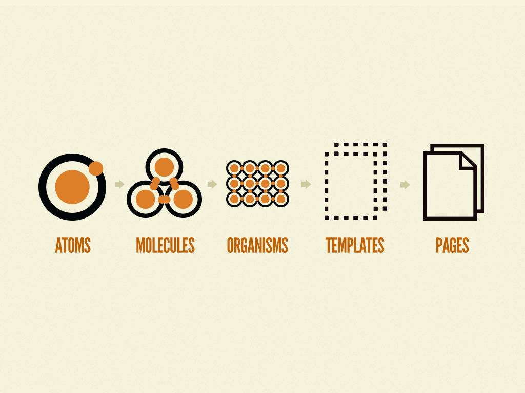
A model of Brad Frost's "Atomic Design Methodology"
All Buttoned Up
Buttons are hands down one of the most foundational and import components to start with and get right. Buttons will often be heavily dictated by a company's color pallatte. Thankfully we already had a relative idea of what our buttons were since they existed within the system, but had a few too many style and color variations. Our goal with updating the buttons was to make sure each button had a clear default and hover/active state. From an accessibility concern this meant that at no point would two side by side buttons appear the same visually both when one was in a default state and another was in an active or hover state. As a result we would need to update the style of our ghost/secondary button so that it no longer matched the default state of our primary buttons.
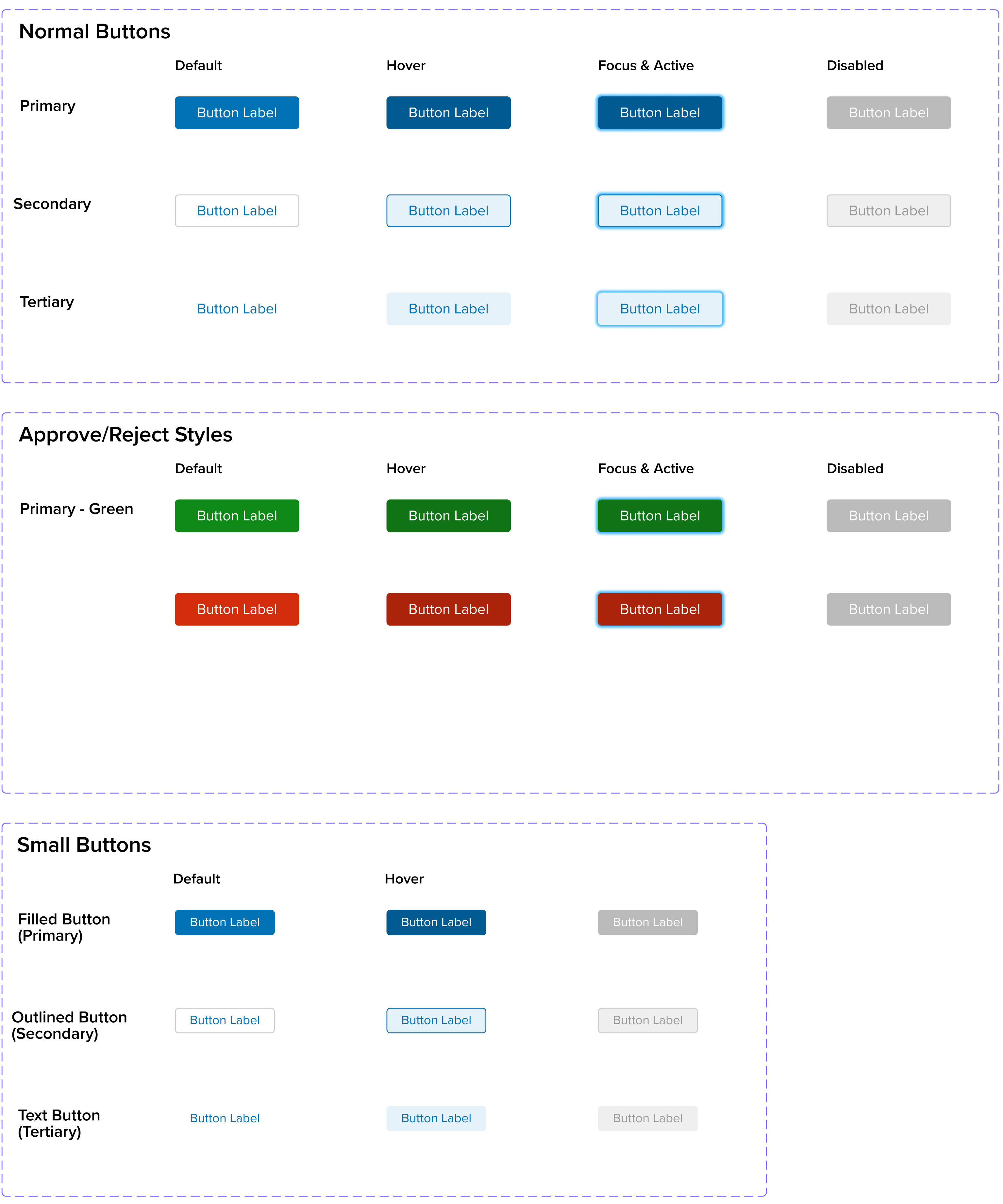
Applause Core Button Styles


Additional Applause Button Styles and Engineering Guidelines
Inputs
While buttons helped to dictate our calls-to-action, the real component that would see the most use and interaction is the beloved input. Inputs, or more commonly knoown as form fields, are how we'd populated the apps with user inputted or selected data. We would need quite a few different variants of inputs such as plain text, multi-select & single-select dropdowns, radio & check boxes, toggles, and more.
While form fields come in a variety of shapes and sizes, all shared a common style and common UX patterns. We create both large and small size variants at both 36 and 28 pixels, allowing us to easily swap them out for vaied row density within tables. They followed the same pattern of using 4px rounded corners, and a gray 1px border that would turn blue when selected or red when invalid. They could sometimes contain hint text or validation error messaging. And they would always have different hover, focus, and selected states so that they could be easily used by users with disabilities. Take a closer look at some of our varied inputs that I designed below.
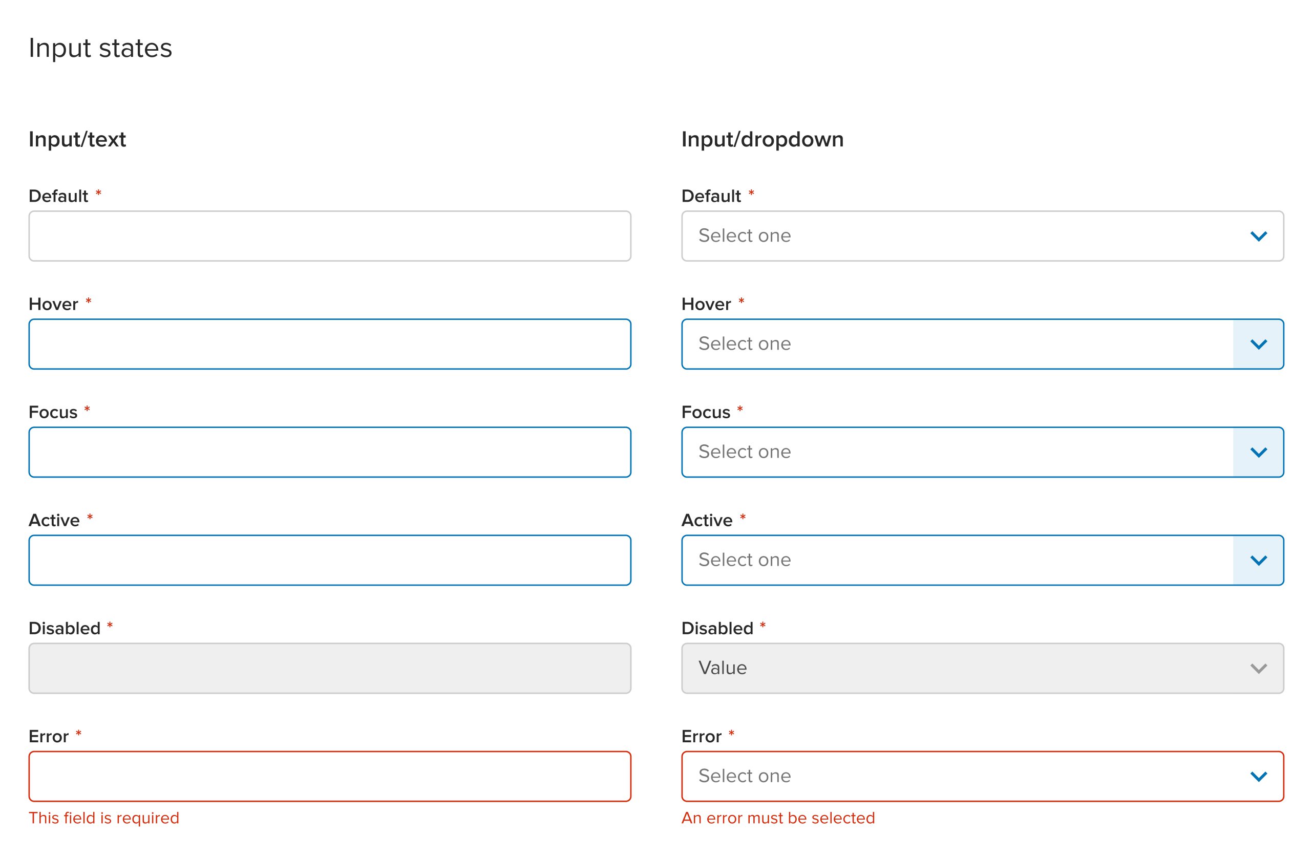
Input States


Input Component Designs
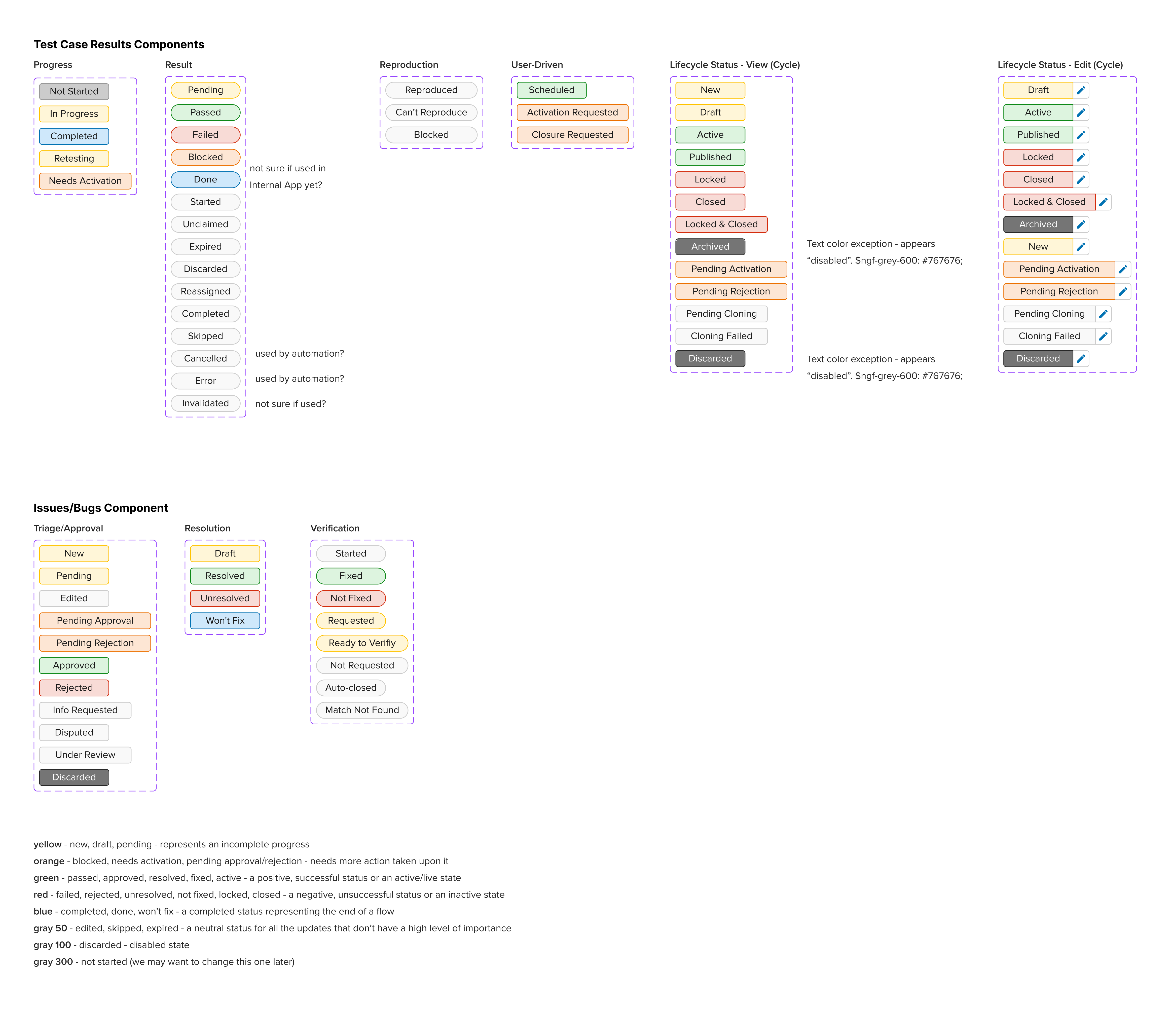
Statuses
While the rest of our app components primarily used gray or blue, with the occassional pop of error validation red, statuses were where we could bring in large pops of color that would help to quickly identify the state of a page at a glance. I wanted to make sure the use of color outside of statuses was used sparingly so that these status elements both stood out, and could have specific color definitions associated with them.
Our status indicators were inspired by the Carbon Design System. Yellow would be used for "Caution" and represents an incomplete progress such as new, draft, pending states. Orange would be used sparingly due to it's struggle to be accessible, but would mean that the page or component needs more action taken upon it. Blocked test cases, test cycles that needed activation, and pending approval/rejection statuses were all orange. Green is simple as it meant a positive, successful status or an active/live state. Likewise red is also commonly used to represent a negative, unsuccessful status or an inactive state. Blue, being our primary color, was also used to show a completed status representing the end of a flow. Finally we wrapped up the status color palatte by using various shades or gray to show neutral informative statuses or disabled states.
Through this use of color representation that tied closely to each color's "meaning", we were able to create various status components. Status pills were used within a pages header to show the progress of the page and the data within it. Toasts were used as success, failure, and generic information that would appear at the top of the page before fading away aftr a few seconds. Alerts were permanent, on page, messages that would help to provide users with additional context or show validation. And finally, progress bars would be used to show asynchronous updates that would contiue to happen after a user left and later returned to the same page. These can all be seen in the showcase below.
Status Pills


Status Component Designs
Tables
Our table components needed a total overhaul. They were in rough shape and didn't serve the needs of our users. One of the biggest pieces of feedback we received were that our tables rarely fit the width of a page and if they did they were often truncating lines of text hat included important identifying pieces of information. We had no choice but to redesign them from the ground up. After working with out users to collect feedback we were able to create a new delightful table component that solved many of our users' needs.
First and foremost, this meant that our new tables would need to be more responsive and adaptible. We removed truncation as the default behavior and instead allowed rows to grow in height if text ran to more than one line which was often the case for both the test case name and description columns. While we now allowed rows to be taller, we had no way of controlling our columns so we introduced my favorite featyure, adjustible column widths. Yet, sometimes column widths still caused the table to be too wide. To solve this we both enabled columns to be configurable and hidden if the user so desired, but we also made both the checkbox column and actions columns to be fixed to the left and right side of the table respectively. This allowed users to scroll the interior of the table horizontally while also still being able to perform batch action selection and row actions. Batch actions and column sorting also received an update so that they behaved consistently across the apps.
We rounded out improving the table user experience by introducing a few quality of life updates. One of my biggest pet peeves was that on some pages the tooltips would show up below the row hovered over. This meant that tooltips were constantly in the way as the user scanned down that page. Updating tooltips to only appear above rows, and altering the delays between when they appeared and disappeared allowed us to create a better user experience. Filters, while still a work in progress at this time, were also something we began to explore. While we had existing ways to provide filtering we were committing a cardinal sin of UX by not displaying an overview of filters and instead hiding which ones were active within a dropdown. In order to accomadate this filter overview we also began designing a resuable table console component that would contain a table's primary, secondary, and batch actions, as well as configuration, filters, and search. Wrapping up our experience improvements we introduced fixed column headers to allow users to remember which column they were looking at even as they scrolled down the tables. This also allowed us to update tables so that they now filled the height of the viewport and scrolled within the table rather than having the scroll on the page. That is unless there were multiple tables on a page, which was rare, but in that case would require the table height to be fixed.
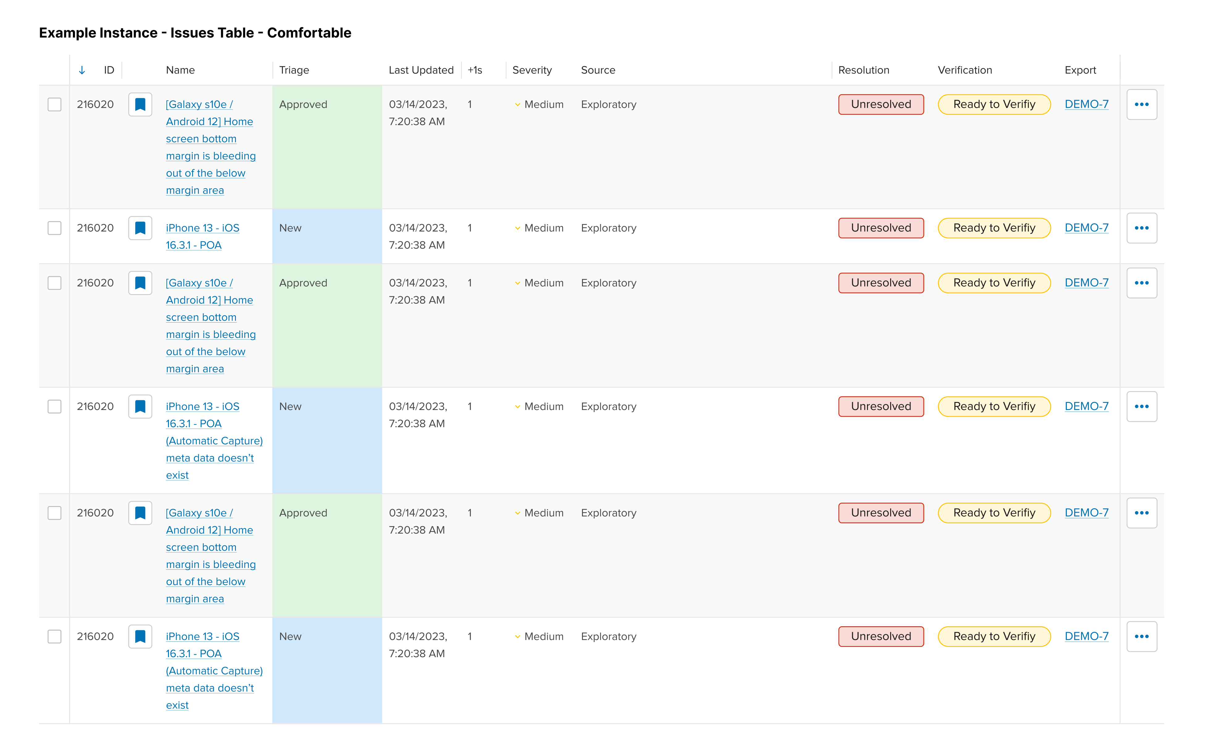
Issues Table


Table Component Designs
Navigation
I am very happy with they way this component turned out. It worked very smoothly and every detail of the experience was expertly crafted by the engineer I worked closely with over multiple iterations.
Prior to my arrival at Appluase, the information architectur of the apps had gotten quite a bit unruly. It because common practice for product managers to simple add another main level item to the navigation list. Working closely with both internal and community users, I was able to parse the navigation into smaller groups and subsections; simplifying the side navigation and making it easier to navigate. Driving the whole list of options to navigate to is an overarching navigation header designed to allow users to be able to quickly swap between various products and devices within just a couple clicks. Lastly, since horizontal space was something we struggled with, I wanted to make sure that this side navigation would be just as easy to use if it was collapsed; even going as far as to have it automatically collapse itself on smaller viewports.


Navigation Designs
Headers
Our existing header components desperately needed a change. They had become bloated in height and took up about a third of the viewport. In addition, our new table components now allowed for fixed column headers, meaning our new page headers would need to collapse a bit themselves to allow for the improved table UX. So, as the user scrolled down the page, certain items within the header would disappear allowing the header to collapse a bit. Yet, keeping the header fixed and present at the top of the page meant users could quickly get back to the top level actions of the page.
I designed one versatile header component that could easily hide or show different parts of itself depending on the type of page and the amount of data or actions needed within. This allowed us to provide a consistent experience as the user navigated from page to page without the informatin within the header jumping drastically on them. The designs below show the header in some of its various states as well as the detailed markup and notes I would often add for engineers in addition to Figma's developer mode.


Header Designs
Conclusion
Outcomes
I absolutely love product design systems. This is truly one of my favorite projects I have worked on in my career. The impact this had on the overall product ecosystem was monumental. Building design components out as fully realized engineering components meant a drastic reduction in engineering time as well as less mistakes. Building the user experience and state changes into each component also meant less headache for our engineers who were often more well-versed in the back-end than front-end development. I hope that I get the opportunity to work on many more projects like this one in the future.